About the Ad

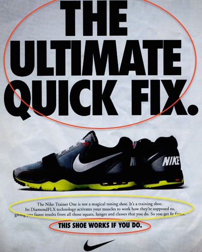
This image was designed to by Nike to advertise the Nike Trainer One. I found the image in an article for the Nike blog, titled “Nike Women Ad: Nike’s Take on the ‘Quick Fix'” by Lucas Ehrbar. The image appears to be a magazine ad or something similar to one, butI could not find any other accreditation for the design.
I chose to analyze this ad for its use of two different type categories—Oldstyle and Sans Serif—that contrast each other in an effective way.
Typeface #1: Oldstyle

The first category of typeface in this ad is oldstyle. This can be seen first by the presence of serifs that are slightly slanted and a moderate transition between thick and thin lines on the letters. The letters also have a slight diagonal to them. These are all characteristics of typefaces in the oldstyle category.
I think oldstyle works well in this ad since the text is a little small, which would make other serif categories (like modern or slab serif) very difficult to read. Using oldstyle makes the copy clearer an easier to read.
Typeface #2: Sans Serif

The second category of typeface in this ad is sans serif. It is pretty clear to see that this typeface is sans serif. First, it does not have any serifs, which is the biggest characteristic of this category. Second, there are no thick to thin transitions. Third, there is no diagonal stress. All of these attributes show that this typeface is sans serif.
Contrast

There are a few thing that contrast the two categories of typeface in this ad. The biggest difference that catches the eye is size. The sans serif copy is much bigger than the oldstyle. It is also capitalized, which gives it a larger, blockier form than the other category of typeface. The sans serif type is bolded, which gives it more weight than the oldstyle typeface. I would also mention that the oldstyle typeface has a lighter color than the bold sans serif typeface, which almost give a different texture or feeling to the ad, almost like the appearance of whitespace.
The repetition between the sans serif copy at the top and the bottom works well to give the general message of the ad, while the contrast between them and the oldstyle typeface shows that there is some interesting explanation or commentary. It is very well designed.
Last Thoughts
Overall, I think this ad uses contrast between two typefaces in a great way to convey its main message while still providing some commentary. The type is very clear and organized, and the typeface categories provide the ad with a strong, bold emotion that is still easy to read and enjoyable to look at. I think the design is very good, clean, and professional.
